The problem statement
Savings protection rules are complex and often misunderstood. Users frequently assume their money is protected across different banks, without realising that many brands share a single banking licence, meaning protection limits are applied collectively rather than individually.
This creates a critical gap:
Users can unknowingly exceed FSCS protection limits
Financial risk is hidden and hard to detect
Existing information is fragmented and difficult to interpret
Background context
Why do we need a redesign?
Background
With the rapid evolution of digital banking, users now engage with financial services in more flexible and diverse ways. The rise of new players—such as payment providers and account aggregators—meant the existing tool, originally designed for traditional banks, no longer reflected the modern financial landscape.
The objective was to design a tool that helps users:
1. Clearly understand how much of their savings is protected
2. Identify risk across multiple accounts and providers
3. Make informed decisions to fully protect their money
User Centred Design Process
Working with a research agency
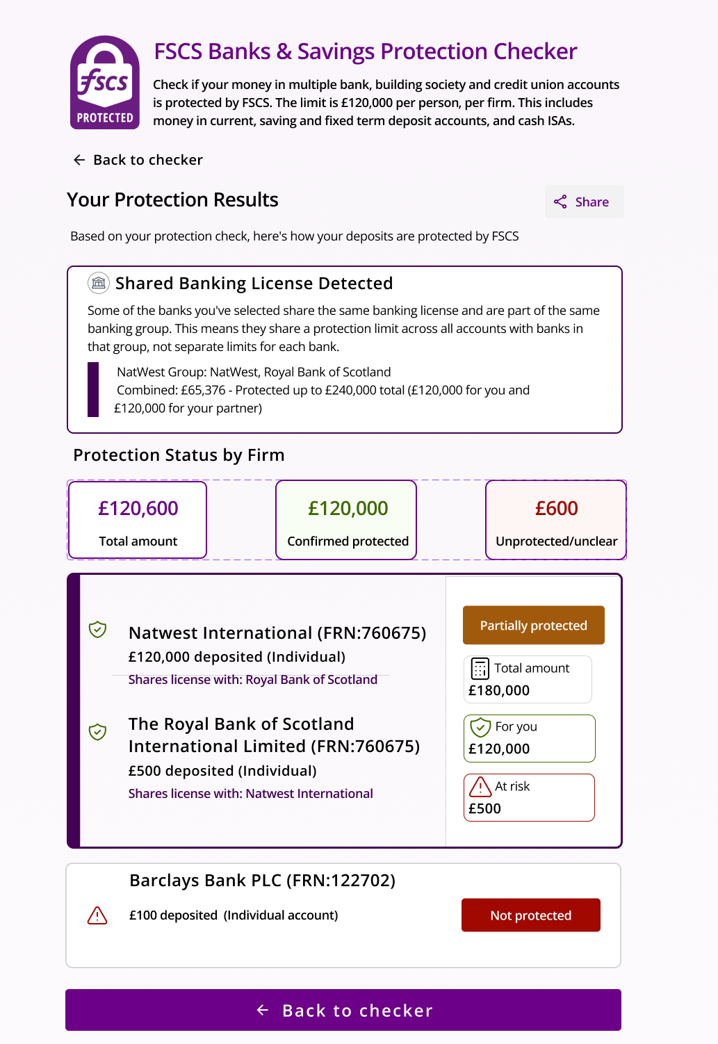
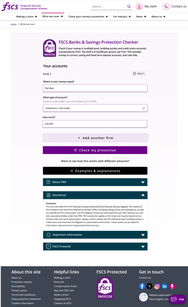
This redesign focused on transforming both the interface and the underlying experience. It incorporated complex data from a broader ecosystem while surfacing key account attributes—such as joint ownership, business accounts, charities, and shared banking licences—in a clear and meaningful way.
The process was highly iterative and research-driven. Early-stage research identified gaps, opportunities, and user pain points, which were continuously fed back into the design process. Prototypes were created using Figma and refined through ongoing usability testing, with validation carried out across both internal and external users. Accessibility was embedded throughout, with final designs audited using tools such as BrowserStack, NVIDIA, and automated testing frameworks to ensure compliance with accessibility standards.

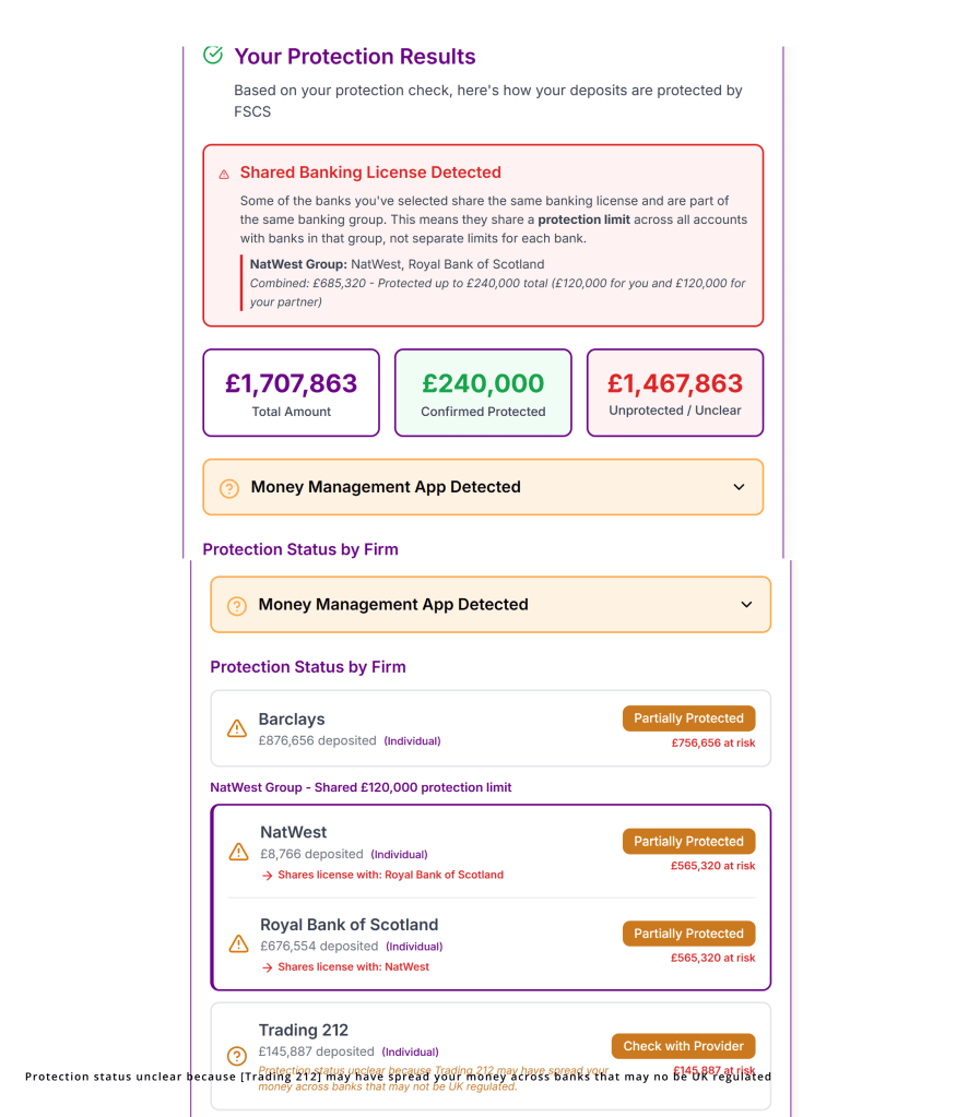
The end product
Not just a revamp
The tool answers a critical user question:
“How much of my money is actually protected if my bank fails?”
By bridging the gap between regulation and user understanding, it enables:
More confident, informed user decisions
Better financial awareness
Reduced exposure to risk
To create an intuitive, accessible tool that adheres to usability best practices—transforming complex financial data into a clear, engaging, and interactive experience that enables users to understand and act with confidence.
Product team
A Figma Make project
The team: Myself, a research agency, content producer, 1 Product Manager with our development team (1 Front-end dev, 1 Back-end dev and 1 tester).
Given the lean team, this was the quickest concept to delivery project .
Start to Delivery: 4 months
UX oriented approach
- Simplification of complexity: Translates regulatory rules into clear outputs
- Progressive disclosure: Introduces complexity only when needed
- Guided interaction: Supports users step-by-step rather than overwhelming them
- Action-oriented feedback: Moves beyond information to recommendations
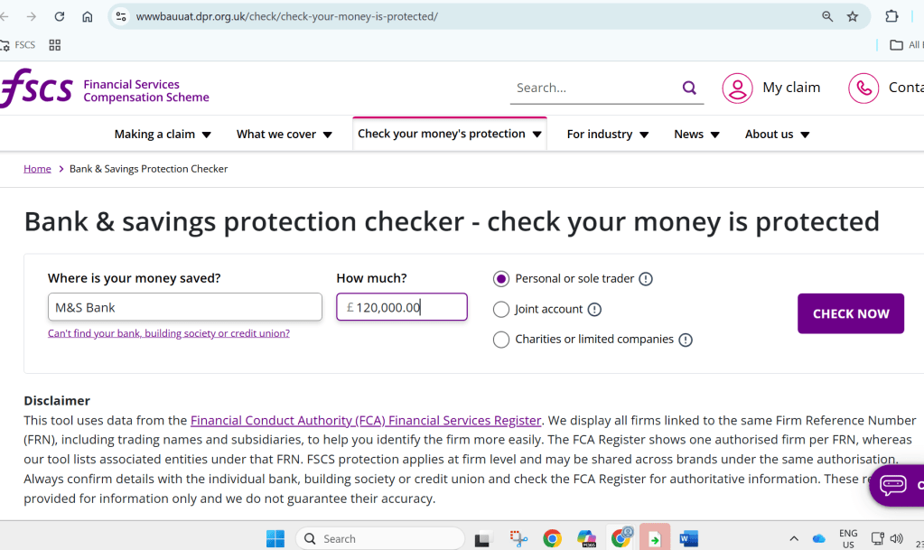
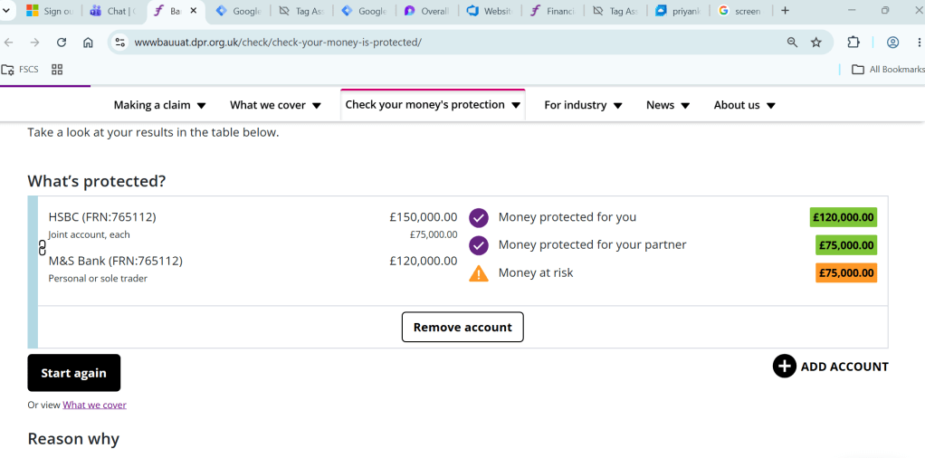
Images of the previous version of the protection engine